Sri Krishna Sweets- Branding or Bending?
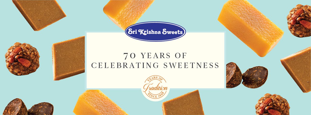
Image Courtesy: Sri Krishan Sweets
If you’re from Chennai or have been there, you’re probably well aware of the illustrious legacy of Sri Krishna Sweets. It has been around since 1948 and its iconic blue and white identity has come to be equated with Mysurpa- its most famous offering. A distinct deep blue oval with the name Sri Krishna Sweets written stylistically over it is a well-recognized logo across the city.
However, a box of sweets from its shop inside the Chennai airport reveals a peculiar twist to the brand story. Nowhere on the box does one see the famous blue and white logo. It is instead replaced by the name SKS written in white over a blue background. The addition ‘FLY’ is a clear reference to the airport and the convenience of picking up a box of sweets on the go.
Now, consider yourself a non-local buying from the shop. There is no way to tell for sure that the sweets belong to the famous brand. The same box of sweets on the website srikrishnasweets carries the original name in its entirety. However, at the airport, the brand is diluted down to its initials. There’s also a buysrikrishnasweets.com (Now closed) and a srikrishnasweets.net that bear the name SKS on the homepage. And in a font different from the one on the actual box.
Now, that’s one too many websites and logos to trust. And the entire scenario brings forth two important points worth consideration.
- How fast and loosely can you play with your brand?
Can an eminent brand afford to toy with its identity even if it doesn’t have to worry about losing out on its consumer base? Even if one were to consider that the root of the confusion stems from a family tussle over trademark, the attitude would still be disrespectful.
Consider the case of the other ‘mithai’ king, Haldiram. Packaged foods, sweets, snacks, restaurants- it is one of the most trusted foods machinery in the country and a very popular gifting option. The packaging aesthetics are unparalleled and despite the diversity in offerings, nothing has altered its logo. The constancy makes the brand recognizable at a glance. And it is this steadfastness that keeps the connect with its consumers intact.
2. Should External Factors Influence Branding?
For the sake of argument, if one were to consider that the change in logo and packaging was in keeping with the location, it brings up another important point- should external factors influence your brand? It may call for a change in offering perhaps. For instance, the global food chain McDonald’s had to change its menu to suit Indian taste buds. However, nothing could dilute its brand identity.
Given that this shop is at the airport, the target group of customers are those that are taking this product to friends and relatives outside the city. That’s a great way to spread the brand name. But if the brand name that reaches the prospective customer’s hands is not your iconic logo, that’s a very big opportunity of building brand recall that’s been lost by SKS.
At the end of the day, branding isn’t a one-time effort but a continuous process in communicating your promise of quality, with your consumers. At GroCurv, our experts understand this. They cater to everything from packaging redesign to brand repositioning, with the singular aim of generating growth in revenue, without compromising on brand image. They are aware with the rules of the branding game and it is this experience that makes all the difference to your business.
- https://www.thehindubusinessline.com/companies/Sri-Krishna-Sweets-goes-online/article20889922.ece
- http://www.srikrishnasweets.com/Chennai-Sweets/RAVA%20LADDU_2%20PCS/1307
- https://www.buykrishnasweets.com/products
- https://spicyip.com/2017/10/oh-sweet-trademark-of-mine.html
- http://www.bcod.in/marketing-and-promotion-techniques-of-haldiram-king-of-sweets-and-snacks/